
 EN
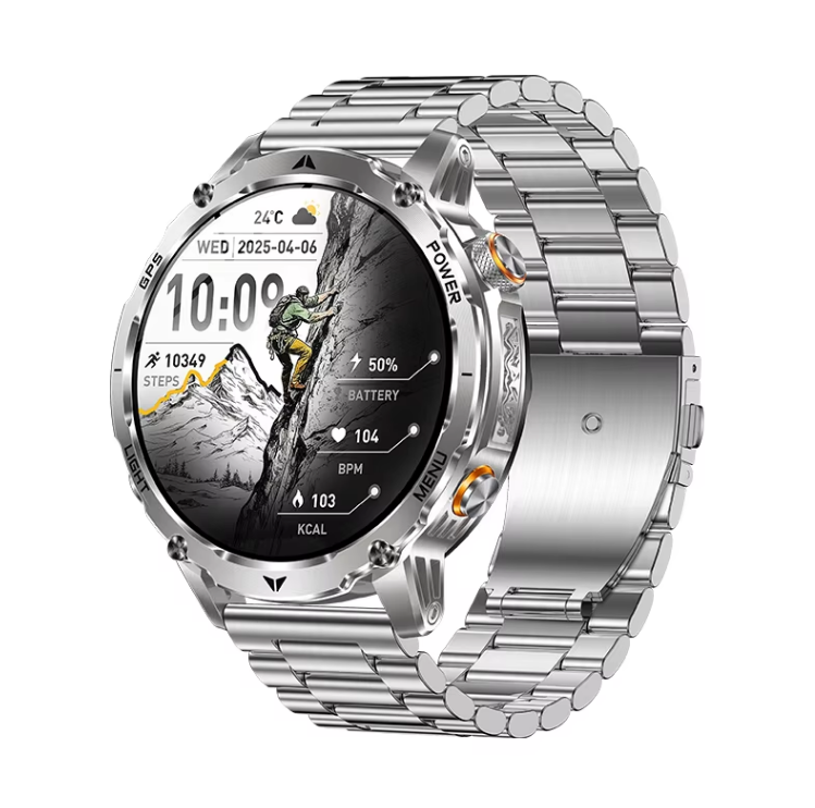
Why a round canvas changes the customization rules
A round smart watch does not behave like a tiny phone screen, and that single fact reshapes every watch face decision. The display is a circle, so the corners are gone. A layout that looks balanced on a rectangular screen can feel cramped or clipped on a circular one. Google's Wear OS design guidance has long recommended keeping critical content inside the inscribed square of a round display, which exposes about 78.5 percent of the total area. That is not a limitation to fight. It is a design constraint to use. Text should sit near the center, complications belong around the perimeter, and background art should follow the curve instead of ignoring it. Once that mental model clicks, customization becomes much less frustrating.
Pick the face type that matches how the watch is used
Watch faces usually fall into a few practical categories, and the right pick depends on daily habits rather than taste alone.
-
Analog faces with hands and a clean dial suit dressier outfits and quick glances.
-
Digital faces with large numbers work well for workouts and outdoor visibility.
-
Hybrid faces combine hands with small data widgets, which is often the best compromise.
-
Minimal faces strip things down for battery life and a jewelry-like look.
The key is to start simple. A cluttered face on a circular display is harder to read than the same layout on a rectangle because the edges compress content. A beginner-friendly approach is to pick one analog face and one digital face, then customize only the accent color and one or two complications. That keeps the round geometry working in favor of legibility.
Color, contrast, and complications that actually read well
Color choice matters more on a round smart watch because the bezel frames the dial and can shift perceived contrast. Dark backgrounds tend to make bright hands and digits pop, which helps outdoors. Light backgrounds can look elegant but wash out under direct sun. A simple rule is to keep the hands and the most important data point at the highest contrast pair available. Complications deserve the same discipline. Step count, heart rate, date, and battery are common choices, but stacking four or five around a circular edge can crowd the display. Two or three well-chosen complications usually look better than a full ring of small icons. Font size is another trap. Small fonts look sharp in promotional renders and become unreadable on a moving wrist. Testing a face while walking, not while sitting at a desk, is the honest check.
| Customization choice | Round smart watch behavior | Rectangular smartwatch behavior | Practical tip |
|---|---|---|---|
| Text placement | Corners are unavailable, center band is safe | Full width usable | Keep labels inside the inscribed square |
| Complication layout | Perimeter ring works naturally | Grid or corner placement | Limit to two or three items |
| Background art | Curved edges crop corners | Flat edges crop differently | Design for the circle first |
| Analog hands | Classic proportions feel native | Can look borrowed from phones | Use shorter hands on small cases |
| Battery impact | Always-on faces drain faster | Same principle applies | Dim or simplify in always-on mode |
The compatibility and app ecosystem question
Customization options depend heavily on the operating system and the companion app. Some platforms allow third-party watch face installation, while others keep the store curated. Some brands expose deep customization through a phone app, including background photos, color themes, and complication slots. Others limit users to a fixed gallery. Before buying, it helps to check three things. First, whether personal photo backgrounds are supported. Second, whether complications can be reassigned. Third, whether always-on display behavior can be configured separately. A round smart watch with a rich face editor is more fun to own, but the editor quality varies a lot. A face that looks great in the picker can render poorly once it is scaled to the actual circular screen.
A field lesson on face scaling and circular clipping
During a face pack adaptation for a boutique brand, the team found that artwork exported for a 454 by 454 pixel square canvas was being cropped in ways that cut off the date complication at the bottom of the dial. The face looked fine in the design file. On the watch, the lower arc clipped the text. The fix was not a new renderer. It was a revised safe zone guide that pushed all text inside the inscribed circle and kept decorative elements in the outer ring. That lesson applies broadly. Designers who come from phone UI backgrounds tend to treat the full canvas as usable space. On a round smart watch, the usable space is a circle inside a square, and the outer ring is best reserved for decoration or low-priority icons. Testing on the actual device, at actual size, catches problems that desktop mockups hide.
Battery, always-on mode, and readability tradeoffs
Customization has a cost. Animated faces and bright backgrounds draw more power, and always-on display modes change how a face should be designed. A face that looks rich in active mode may need a stripped-down variant for always-on use, with fewer pixels lit and simpler shapes. Readability is the other side of the coin. High-contrast faces with large digits are easier to read at a glance, which matters during exercise or driving. Highly detailed analog faces look elegant but can be hard to read in motion. The honest tradeoff is that no single face covers every situation. A small rotation of two or three faces, each tuned for a context, usually serves better than one heavily customized face trying to do everything.
For brands building customizable round-case wearables, Karen M offers Shenzhen-based manufacturing experience, quality control discipline, and supply chain support that help turn a watch face concept into a polished, producible product.
Table of Contents
- Why a round canvas changes the customization rules
- Pick the face type that matches how the watch is used
- Color, contrast, and complications that actually read well
- The compatibility and app ecosystem question
- A field lesson on face scaling and circular clipping
- Battery, always-on mode, and readability tradeoffs


